 Image 1 of


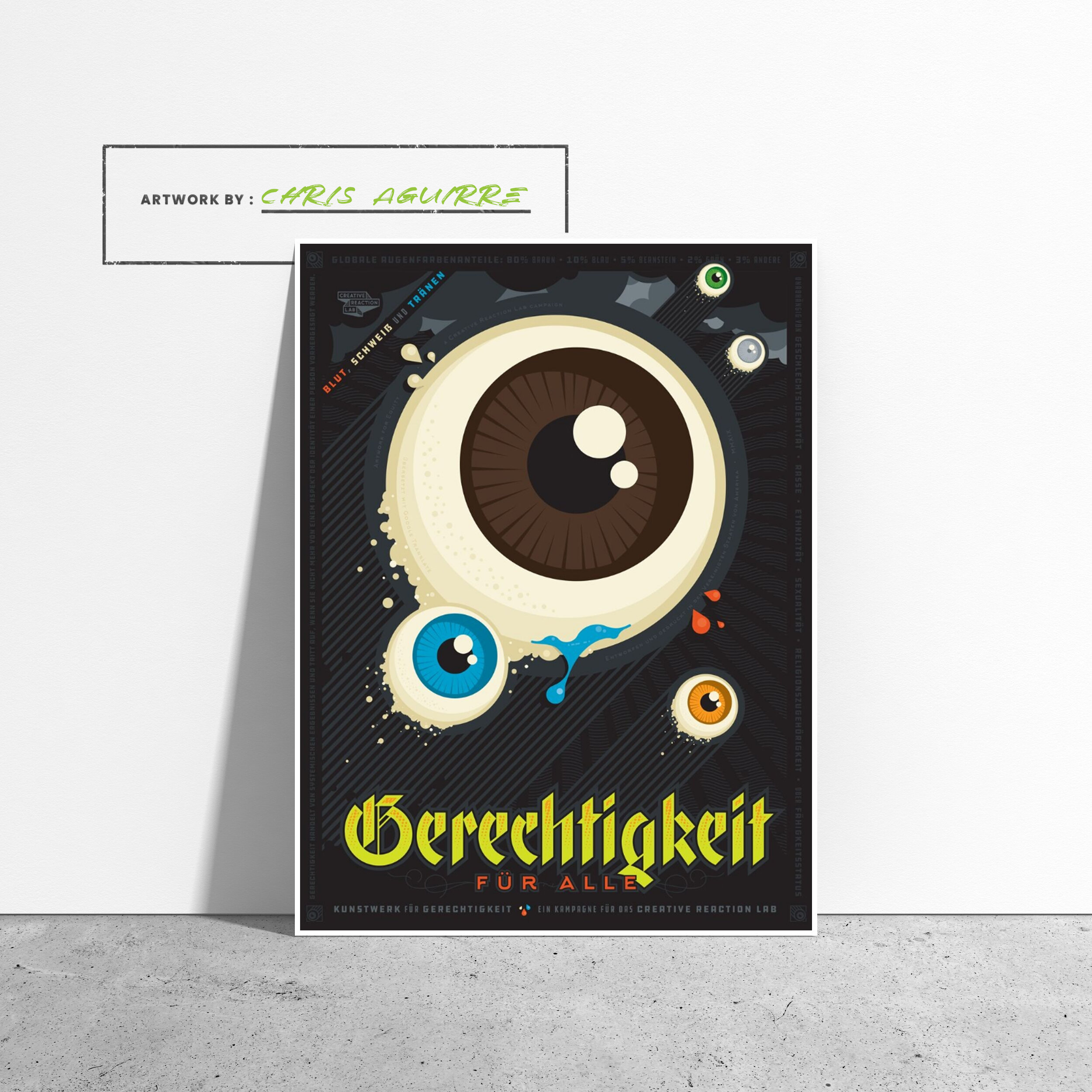
Gerechtigkeit liegt im Auge der Entfremdeten (Equity is in the Eye of the Disenfranchised). (Artist: Chris Aguirre) Poster
Designed by Chris Aguirre for the 2019 Artwork for Equity Advocacy Campaign.
—
(Equity Is in the Eye of the Disenfranchised), takes much of its inspiration from some of the most effective poster design in history - Nazi propaganda - and co-opts, reinterprets, and subverts it to disconcert and challenge the viewer to engage with the piece despite whatever confusion or unease they might experience.
The real challenge was figuring out how to convey the disparate groups of marginalized communities seeking equity across the spectrum of venues from which they have been systematically excluded. After much research and exploration, the human eye presented itself as a concise and iconic way in which to represent all humanity. Mitigating what are admittedly some challenging influences the creative itself is cartoonish, quirky, and playful. The squadron of giant eyes - sized according to the global breakdown percentages of the major categories of eye color - takes flight to fight the good fight of ... Gerechtigkeit fur alle (Equity for All).
The piece not only mimics the heroic composition of fascist and military propaganda but it literally speaks in the language what was once called the Herrenrasse (master race) by Hitler's totalitarian regime. The use of German is not by any means meant pejoratively toward those of German descent. Rather it's to take the viewer off guard and ask them to reassess their reaction to a language that is in and of itself as inculpable of wrongdoing as any other language. It's used to challenge ideas about immigrants, and how language can be both formally and informally policed in the US (e.g. "Speak English, you're in America.") by American citizens (particularly when a non-European language is spoken by people of color). It's used to suggest that multiculturalism is a worthy ideal regardless of the cultures involved. And, finally, it's worth noting that Americans of German descent make up the single largest ethnic group in the US yet only 2% of those speak German. Writing the piece in German as translated by Google is a way of questioning what heritage and ancestry is truly what "white America" takes pride in.
All of these conceptual and design decisions were employed in the hope that the piece does not simply provide a passive viewing experience but one that causes the viewer to explore, question, learn, and reflect on the visual and literal language used.
- Chris Aguirre
29. Januar 2019
Chris is a husband-and-fathering-non-drinking-or-drugging-Mexican-Americaning–recovery- advocating-weekly-podcast-hosting-West-Coast-originating-graphic-designing kinda guy.
—
Twitter: @theChrisAguirre
IG: @therealchrisaguirre
Web: theChrisAguirre.com
